Instagram Reels Cover Photos That Look Clean, Clickable, and On-Brand
A Reel cover photo does more than decorate a post—it sets expectations, communicates the topic at a glance, and keeps the grid looking consistent. A strong cover makes it easier for new visitors to understand what the account offers and helps returning followers quickly find the content they want. Use the guide below to create covers that stay readable on the grid, match brand visuals, and work across devices. For more guidance, see Everything You Should Know About Designing Instagram Reel Covers.
What a Reel cover needs to do (and what it doesn’t)
The best Reel covers act like clear labels. They don’t need to explain every detail—just make the next tap feel obvious. For further reading, see What Makes a Good Reels Cover? 5 Design Tips That Actually Work.
- Explain the Reel instantly: communicate a clear promise or topic in 1–2 seconds.
- Stay readable at small sizes: covers are often seen as tiny thumbnails on the profile grid.
- Maintain brand continuity: consistent colors, typography, and layout build recognition over time.
- Avoid over-designing: the cover is a signpost, not a poster—too many elements reduce clarity.
- Support browsing behavior: viewers often scan multiple thumbnails before choosing what to watch.
Dimensions, safe zones, and how the grid crop changes everything
One of the biggest reasons covers “look off” is that Instagram displays the same cover in different contexts with different crops and overlays. Design for the vertical frame first, then protect the center area so it survives the profile grid.
- Design for vertical: the cover should look right when opened inside Reels.
- Plan for the profile grid crop: keep focal points and text centered and away from edges.
- Keep headline text in the middle portion: it’s more likely to survive multiple crops and UI overlays.
- Use a single focal point: a face, product, or bold word beats a busy scene.
- Test at thumbnail size: zoom out until it’s tiny and confirm it’s still readable.
Cover layout checklist by viewing context
| Where it appears |
What gets cropped/covered |
Design priority |
| Profile grid thumbnail |
Edges often cropped; text becomes tiny |
Large, high-contrast headline; simple composition |
| Reels feed / full view |
UI elements may overlay corners |
Keep critical text centered; avoid bottom-heavy text |
| Explore / recommendations |
Competes with many thumbnails |
Strong contrast, recognizable subject, minimal words |
| Saved/Reels tab browsing |
Fast scanning behavior |
Repeatable template; consistent typography for recognition |
Branding that feels consistent without feeling repetitive
Consistency doesn’t mean every cover is identical. A better goal: someone should recognize your covers before reading them.
- Create 2–4 cover templates: rotate layouts to avoid a copy-paste look while staying recognizable.
- Lock in a small brand palette: one primary background color, a secondary accent, and one neutral is plenty.
- Choose one headline font (and optionally one supporting font): fewer type choices = faster recognition.
- Use consistent photo treatments: similar lighting, filters, or background removals keep the grid from feeling patchy.
- Add a small brand marker only if it stays legible: tiny logos often turn into visual noise on thumbnails.
Text that can be read in a split second
Most people don’t “read” the grid—they scan it. Your cover text should work like signage: minimal words, high contrast, and clear hierarchy.
- Keep it short: aim for 2–6 words that describe the value or outcome.
- Prioritize clarity over cleverness: inside jokes and abbreviations usually reduce taps from new visitors.
- Increase contrast: light text on dark background or dark text on light background; avoid mid-tones.
- Use hierarchy: one main phrase, optional small label (series/category), nothing else.
- Avoid top/bottom placement: those zones are where crops and UI elements interfere most.
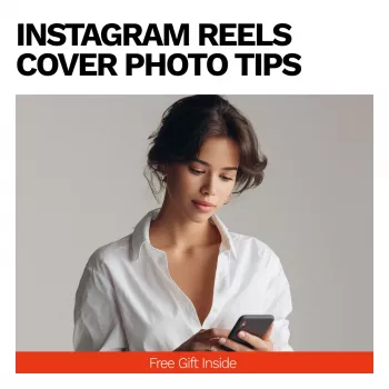
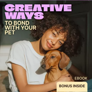
Imagery choices: face, product, screenshot, or graphic?
The best image choice depends on what you’re selling or teaching. The key is committing to one visual story so the thumbnail stays punchy.
- Faces: great for creators—expression adds emotion and can stand out in crowded feeds.
- Products: ideal for businesses—show the hero item clearly with minimal background clutter.
- Screenshots: best for tutorials—crop tightly to the key step or final result.
- Graphic-only covers: can look premium when typography is strong and spacing is clean.
- Avoid “everything at once”: mixing face + product + multiple icons often shrinks everything into noise.
A quick thumbnail checklist before publishing
Common cover mistakes that quietly hurt performance
A simple workflow to create covers faster (batching and reuse)
Downloadable guide for consistent Reel covers
Helpful references for platform specs and design basics
- Instagram Help Center
- Meta Business Help Center
- Canva Design School
FAQ
What size should an Instagram Reel cover be?
A practical approach is to design a vertical cover at 1080 × 1920 (9:16). Keep key text and the main subject centered because the profile grid can crop the edges, and leave comfortable margins so nothing important gets cut off.
Why does my Reel cover look cropped on my profile grid?
Instagram shows your cover differently in the full Reel view versus the profile grid thumbnail, which often trims the top and bottom (and sometimes the sides). Reposition your headline and focal point toward the center “safe area” so the grid preview still looks intentional.
Should Reel covers include text?
Text helps when it clarifies the topic fast and supports quick browsing, especially on a grid full of thumbnails. Keep it to a short 2–6 word headline, use strong contrast, and stick to one clear message with simple hierarchy.
Recommended for you


Leave a comment